case study
AtlasNXT
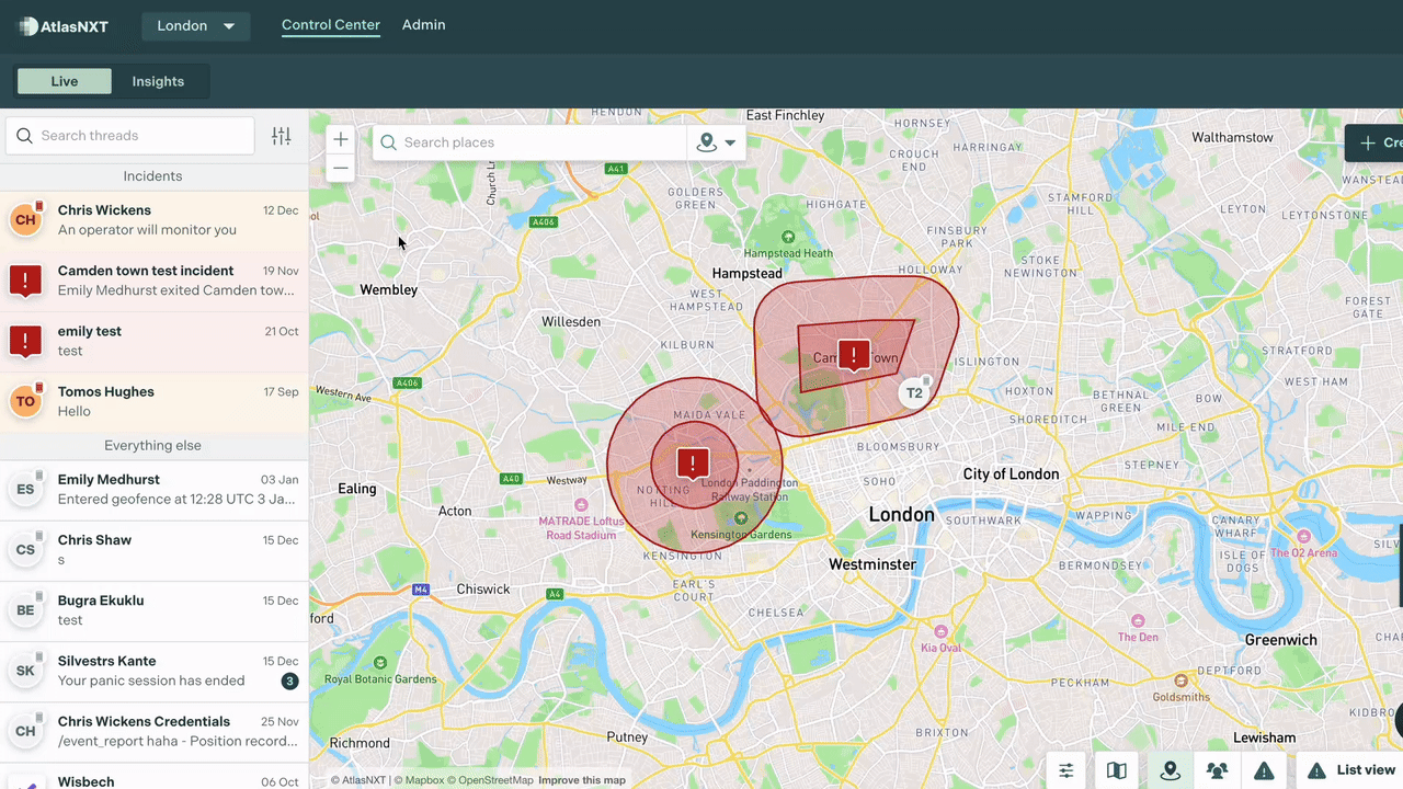
AtlasNXT is a duty-of-care platform used by organisations including the BBC, UN and FCDO.
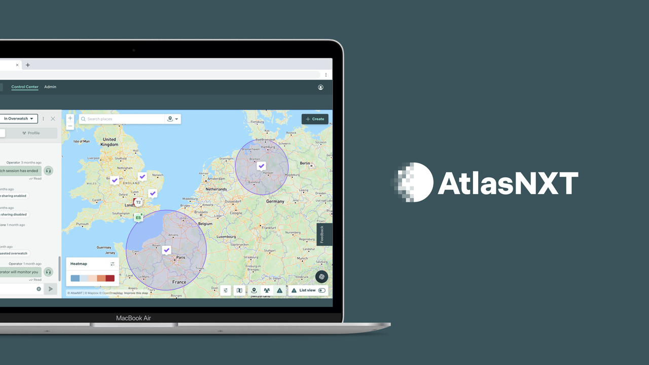
AtlasNXT is a SaaS duty-of-care platform developed by Track24 to help organisations monitor and protect their staff in high-risk environments, such as conflict zones or politically unstable regions. The platform is two-fold: a real-time map interface for operators, and a field app / Garmin InReach device used by employees who can be alerted to dangers and tracked to ensure they stay safe.
Context & Problem
When I joined Track24 at the end of 2024, AtlasNXT was already live and functional. The Elixir Phoenix application had been built by a rotating door of contractors working largely in silo. While the platform worked functionally, the frontend experience lagged behind:
- UI consistency was extremely poor, with many elements minimally designed or left with browser defaults.
- User flows felt fragmented.
- Little visual feedback, animation, or polish.
- The interface did not inspire confidence proportional to the seriousness of the product’s use cases.
- The platform met baseline requirements but offered no customer delight.
Given AtlasNXT’s use in genuinely high-stakes situations, these issues directly affected usability, trust, and operator efficiency, and made the product harder to market and sell.
My Role
I joined as the de facto Lead Frontend Engineer, with ownership over user experience and frontend architecture. I wasn’t hired to ship major new features initially, but to raise the quality bar across the application and transform a purely functional interface into one that felt deliberate, trustworthy, and calm under pressure.
Subtle UI animations introduced across the platform.
Approach
Rather than a single large redesign, my first six months focused on systematic, incremental improvements across the entire UI:
- Worked closely with the in-house product designer to identify and prioritise UX improvements.
- Documented and tracked UX issues extensively in Linear.
- Audited the application to surface repeated UX pain points and inconsistencies.
- Standardised layouts, typography, and interaction patterns via a Figma design system.
- Introduced subtle animations to increase customer delight and saleability.
- Overhauled high-visibility views such as the login experience.
- Implemented accessibility best practices: focus states, labelling, tab ordering, empty/loading/error states.
- Reduced visual noise in critical workflows where speed and clarity matter most.
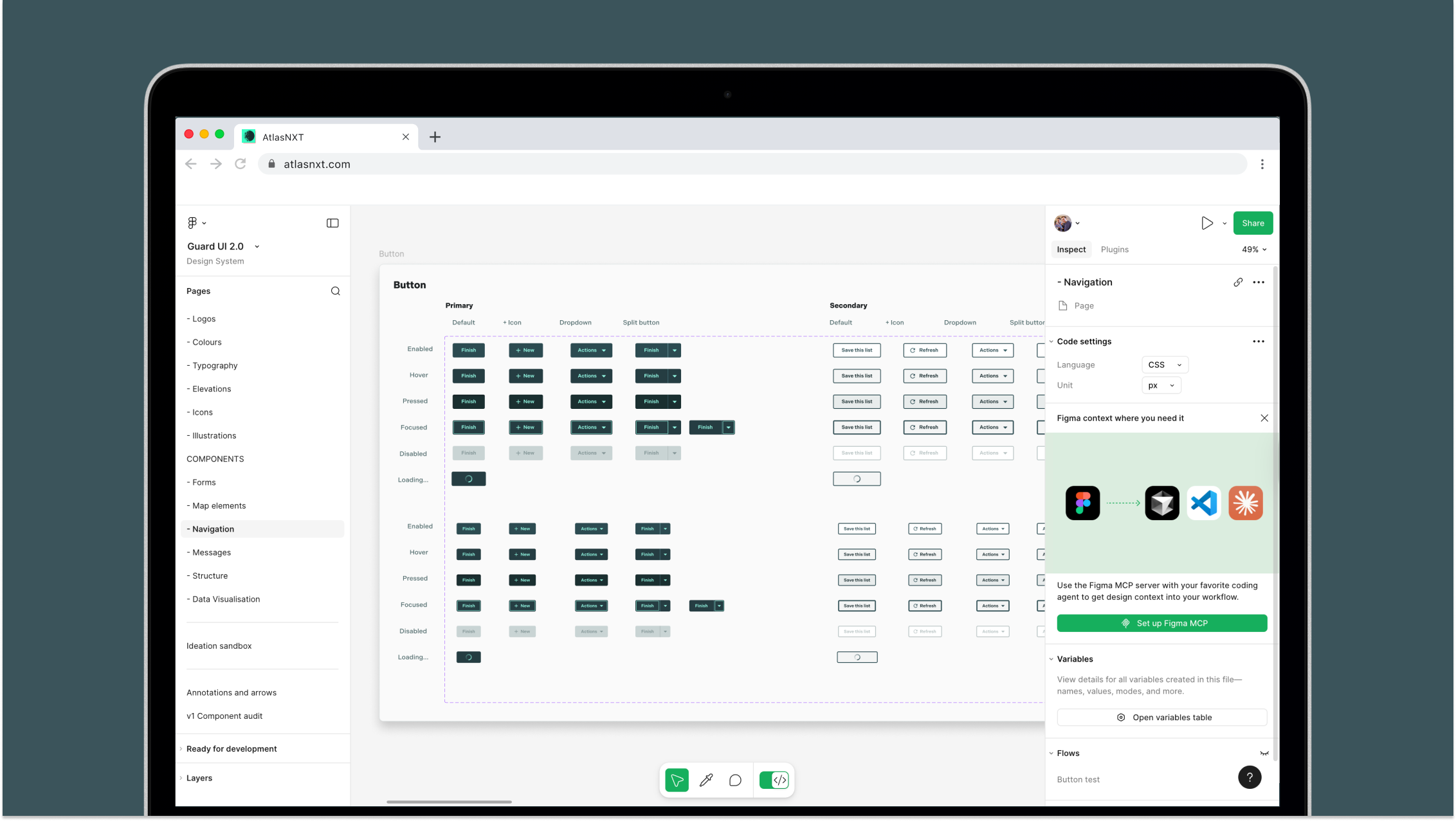
Figma design system.
Key Contributions
- Established a consistent visual and interaction language across the application.
- Refactored ad-hoc UI into reusable, predictable Phoenix components.
- Improved operator confidence and delight through usability and polish.
- Elevated perceived product quality without disrupting workflows.
- Improved accessibility compliance, a key requirement for government contracts.
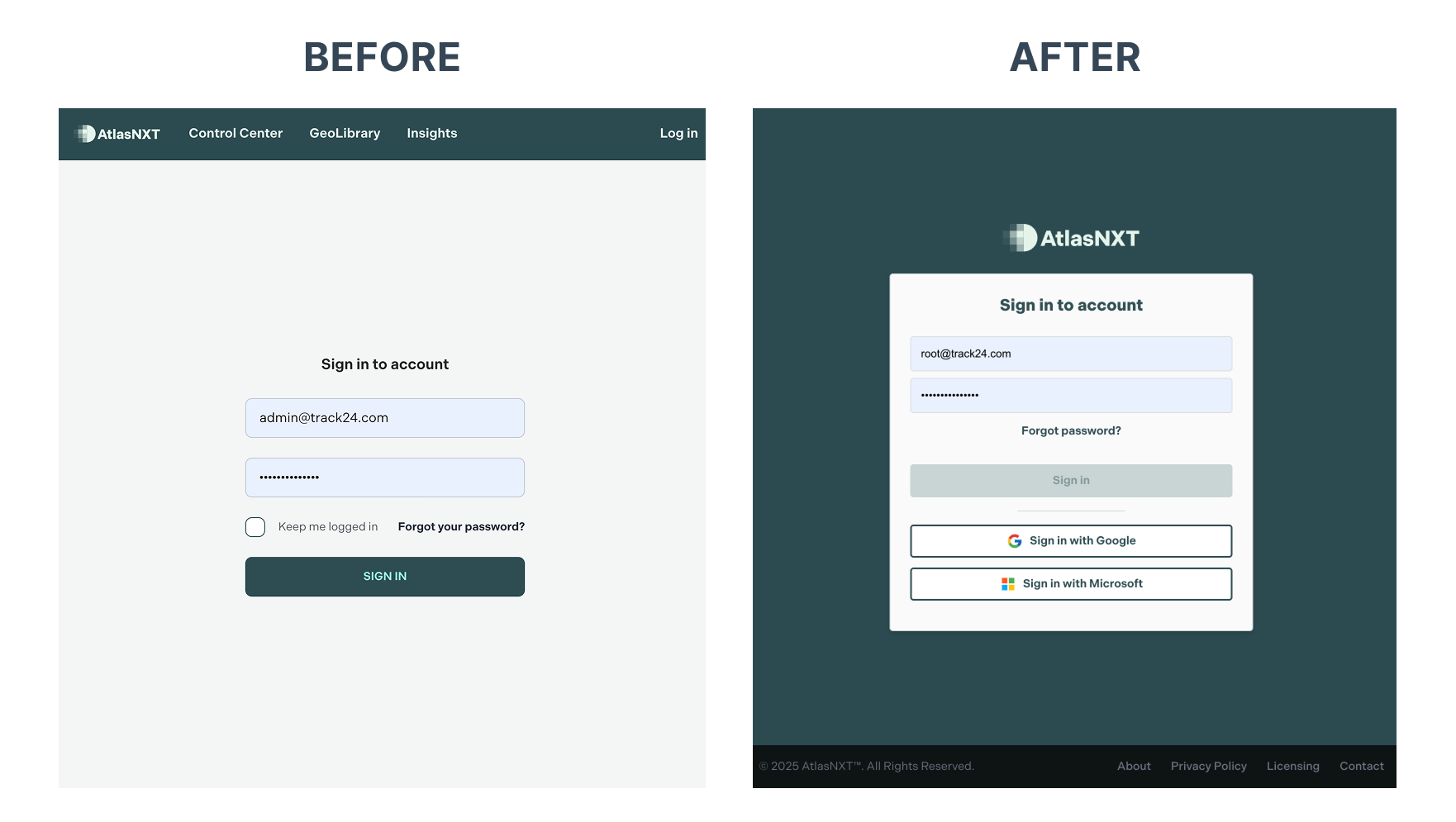
Login page before and after re-design.
Outcome
While much of the work was subtle, the cumulative effect was significant. AtlasNXT evolved from feeling like an internal tool into a polished, production-grade platform suitable for enterprise and government clients.
The improved frontend foundation made subsequent feature development faster and safer, supported by a coherent UI system and reusable components.
These changes translated into real business impact, with clients and stakeholders explicitly complimenting the animations and redesigned login experience.
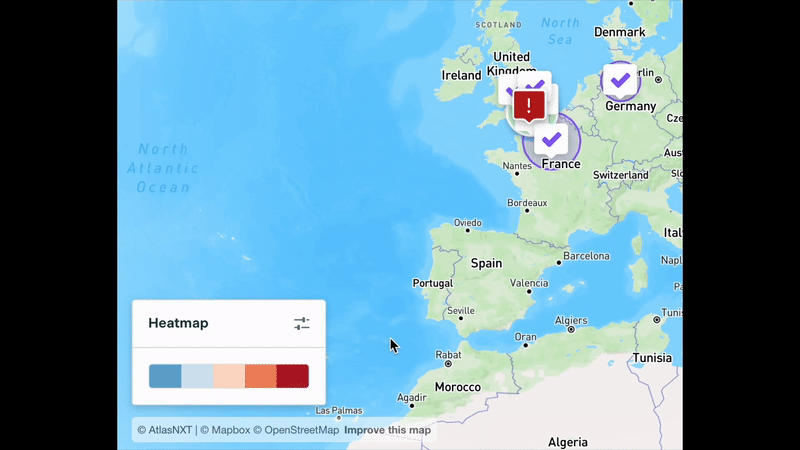
Heatmap animation.
Reflection
This project reinforced the value of quality over quantity. By focusing on consistency, usability, and polish — and extrapolating those improvements across the system — AtlasNXT became more trustworthy, calmer, and more delightful for both existing and future customers.